Most HMO photography I see is an afterthought. A landlord finishes a conversion, hands the keys to a letting agent, and someone takes a handful of phone snaps on the way out. The rooms let anyway, because rooms usually do, but the developer ends up with nothing to show for the work and no reusable marketing library for the next void period.
This Bridgwater project was the opposite. The developer got in touch before the last of the styling went in, with a brief that had two jobs to do at once: build a portfolio set that demonstrates the standard of the conversion to future investors and funders, and produce a bank of room-level images that can be pulled out every time a room becomes available, without booking another shoot.
That dual purpose changes how you shoot a building like this. A portfolio needs the wide, considered, well-composed frames that show design intent. Room marketing needs something more practical: every individual letting room photographed to the same standard, so no tenant ever sees a listing that looks weaker than the room next door. This case study walks through how the shoot was structured to deliver both from one visit.
01The Property
The building is a converted property in Bridgwater running en-suite letting rooms across the upper floors, with a shared open-plan kitchen and living space on the ground floor. The specification is a long way above what the phrase "house in multiple occupation" tends to bring to mind.
There is a consistent design language running through the whole building: sage and olive green feature walls, panelled headboard details, vertical timber slat panelling, graphite kitchen units, herringbone LVT flooring through the circulation and wet areas, and exposed-bulb pendant lighting. That consistency is a gift photographically, because it means the images hold together as a set rather than looking like six unrelated rooms in six unrelated houses.
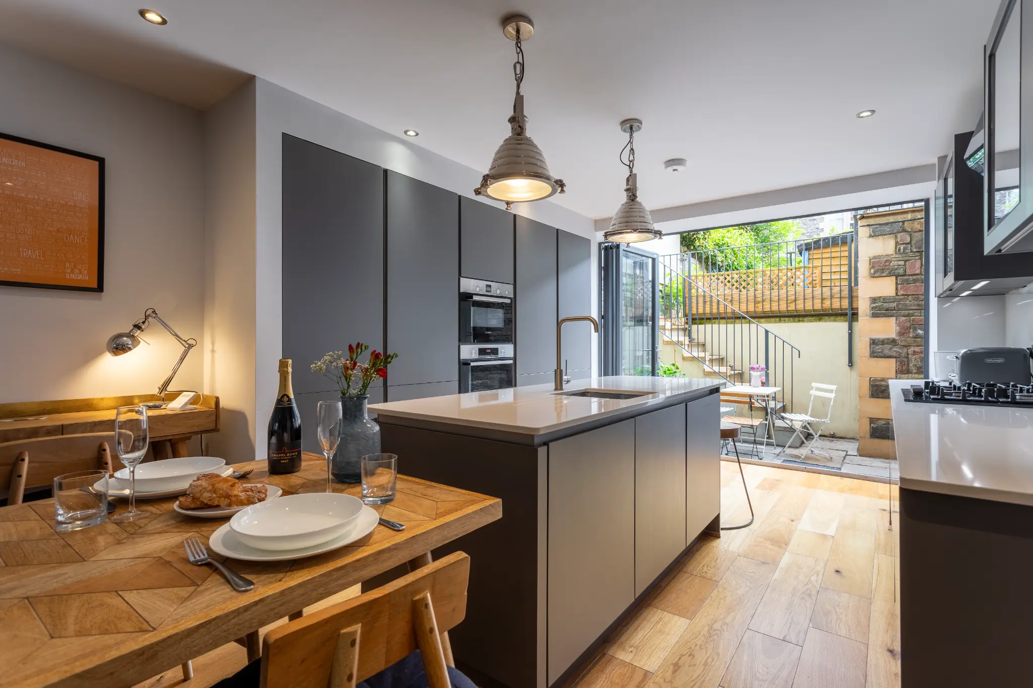
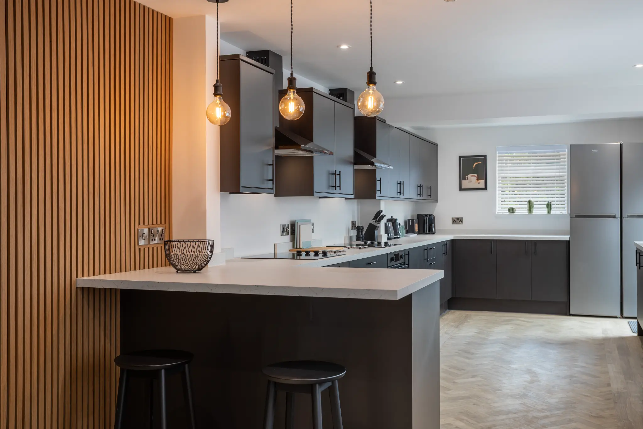
I shot the kitchen first, before anyone had used it. The breakfast bar and stools on the left, the full run of units on the right, and the slat panel at the end give the frame natural depth, and the pendants over the bar provide a foreground element that stops the composition feeling flat. This is the single most important image in the set. It is the one that goes at the top of the portfolio and the one that does the most work in a room advert, because a prospective tenant is really choosing the shared space as much as the room.
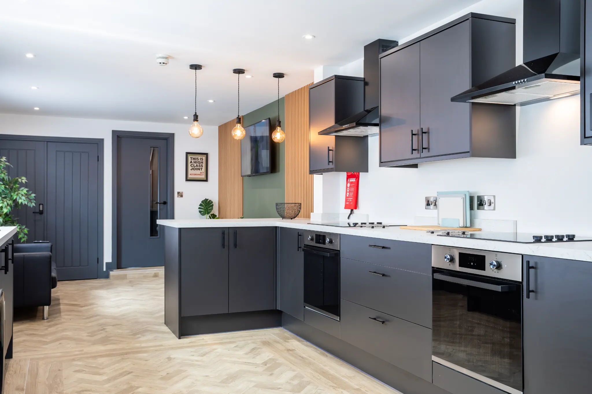
A second kitchen angle covers the working end of the room, the integrated oven and hob, the extractor, and the storage. For a room advert this matters more than it might appear. A shared kitchen is the single biggest source of anxiety for anyone considering a house share, and photographs that show it is genuinely well equipped and genuinely clean remove an objection before the viewing.
02The Shared Living Space
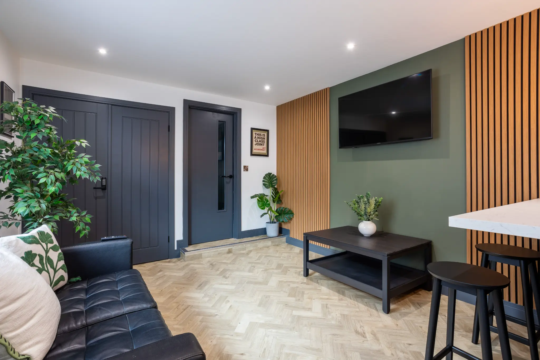
The communal lounge sits alongside the kitchen. Sofa, wall-mounted TV, coffee table, and the same green and timber palette carried through from the kitchen. Shooting this wide, from the corner, shows the actual usable area of the room, which is the question a tenant is silently asking.
There is a temptation with communal spaces to shoot them tight and flattering. I would argue against it. If a lounge is a reasonable size, show it honestly and the images build trust. If you crop in to make it look bigger, the first viewing undoes all of it.
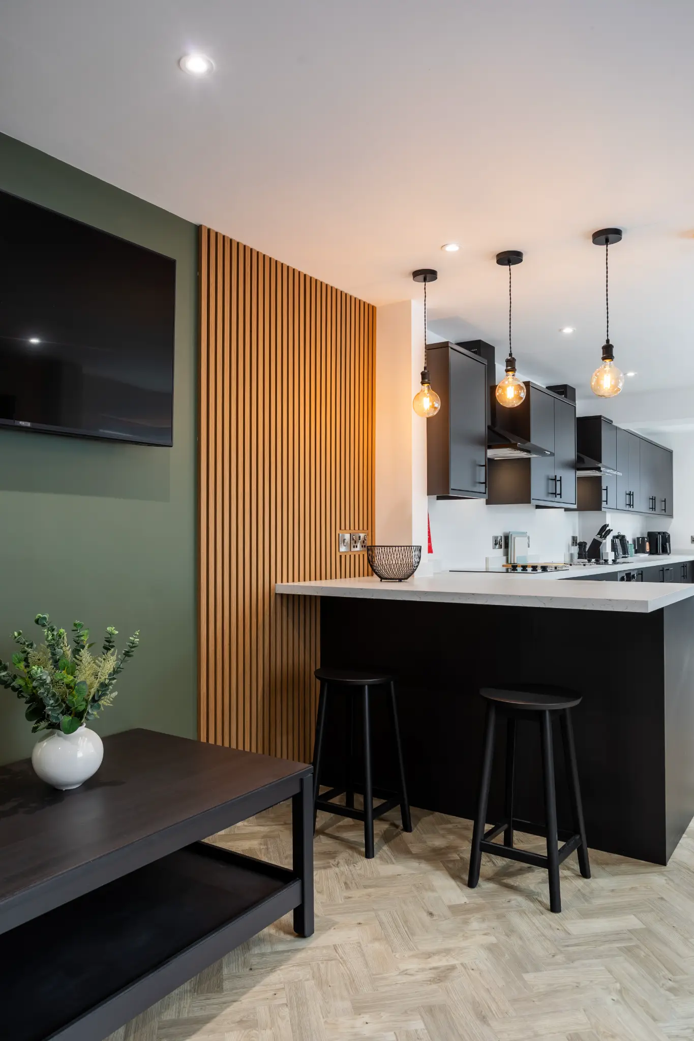
This frame links the two halves of the ground floor together, the living side with its TV wall on the left, the breakfast bar and stools on the right. Images that show how spaces connect are consistently undervalued. A tenant looking at a room advert is trying to build a mental model of the whole building, and a frame like this does more for that than two separate, disconnected shots.
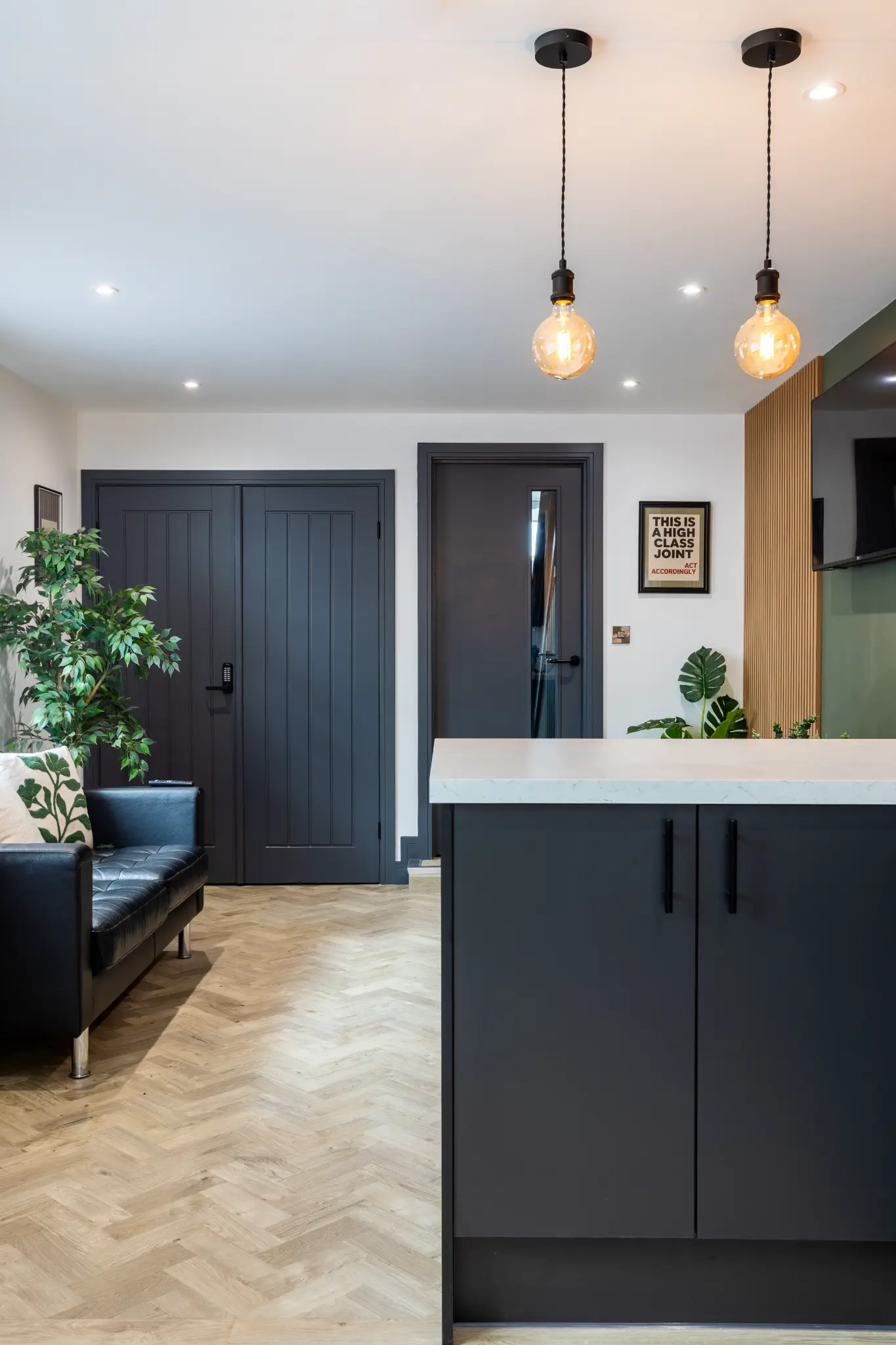
A portrait composition through the threshold between the two spaces. Portrait frames are worth shooting deliberately rather than as an accident, because a significant share of room adverts are viewed on a phone, and portrait images fill a phone screen in a way landscape cannot. Having a few in the library gives whoever writes the advert something that fits the format they are actually publishing to.
03The Letting Rooms
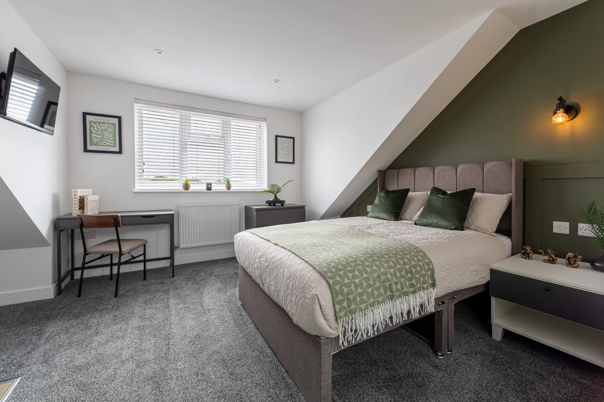
The loft room is the standout. Dual aspect, sloped ceilings, a desk and chair, a wall-mounted TV, and the olive panelled feature wall behind the bed. Rooms with sloped ceilings are genuinely difficult to photograph, because the ceiling line cuts across the frame and a careless angle makes the room feel cramped rather than characterful. Shooting from the corner, with the desk in the near foreground and the bed at the far end, uses the slope to add depth instead of fighting it.
This is the image that anchors the developer's portfolio for this building. It shows the standard of finish, the thought given to the layout, and the fact that a room in a shared house can feel like somewhere you would actually choose to live.
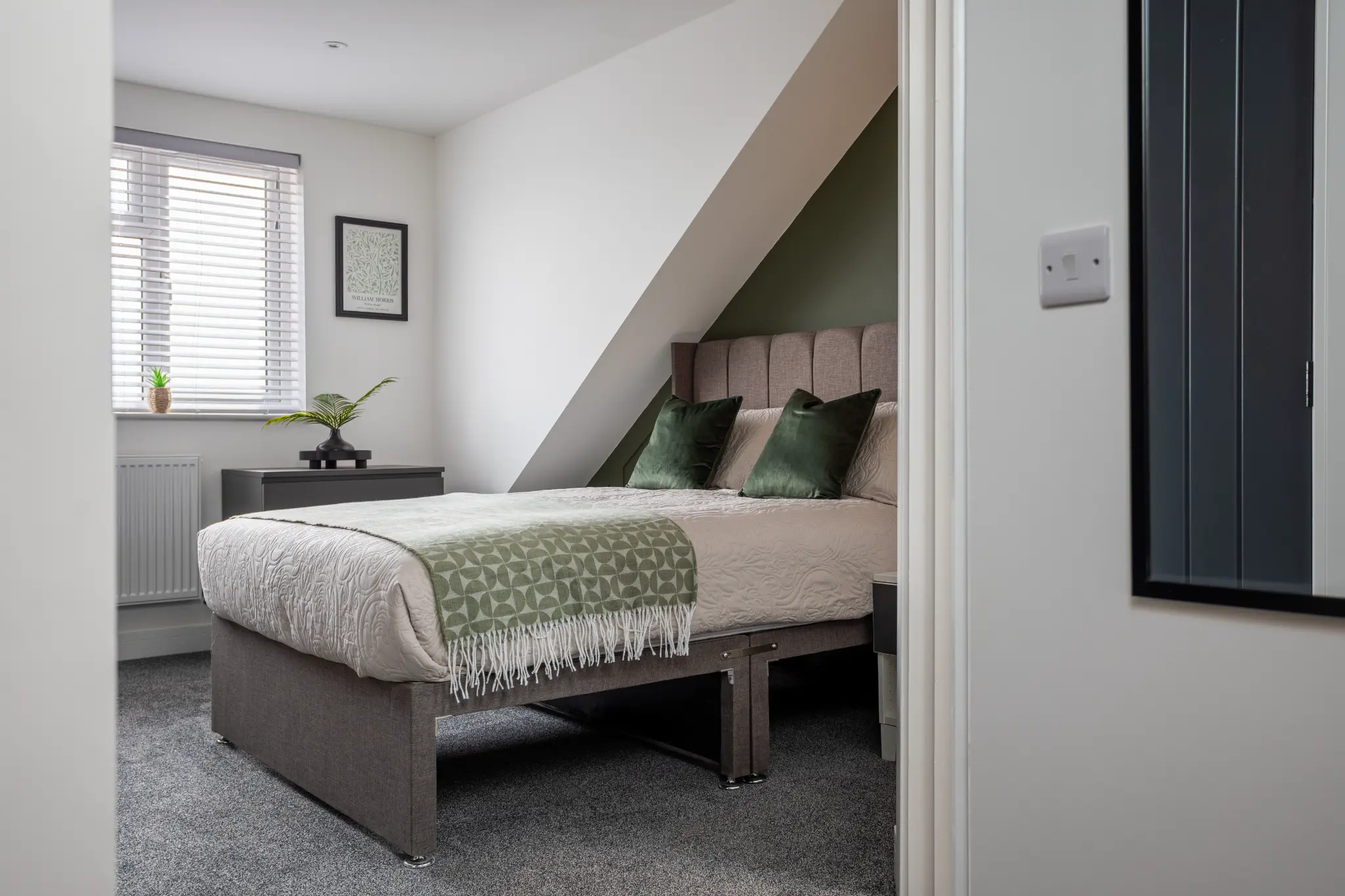
Every letting room got the same treatment: one wide establishing frame from the doorway, showing the bed, the window, and the storage in a single image. This is the frame that goes at the top of a room advert. Consistency across the rooms is the entire point. When a room becomes available in eighteen months, whoever is marketing it does not need to think about which image to lead with, because every room has the same lead frame shot to the same standard.
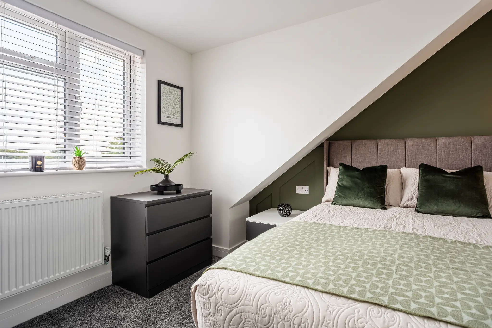
A second room, same approach. Large window, chest of drawers, double bed. The natural light in this room is excellent and the exposure was blended to hold both the interior detail and the view out of the window rather than letting it blow out to white. A blown-out window is the fastest way to make a bright room look like a cave, and it is the most common single fault in phone photography of rental rooms.
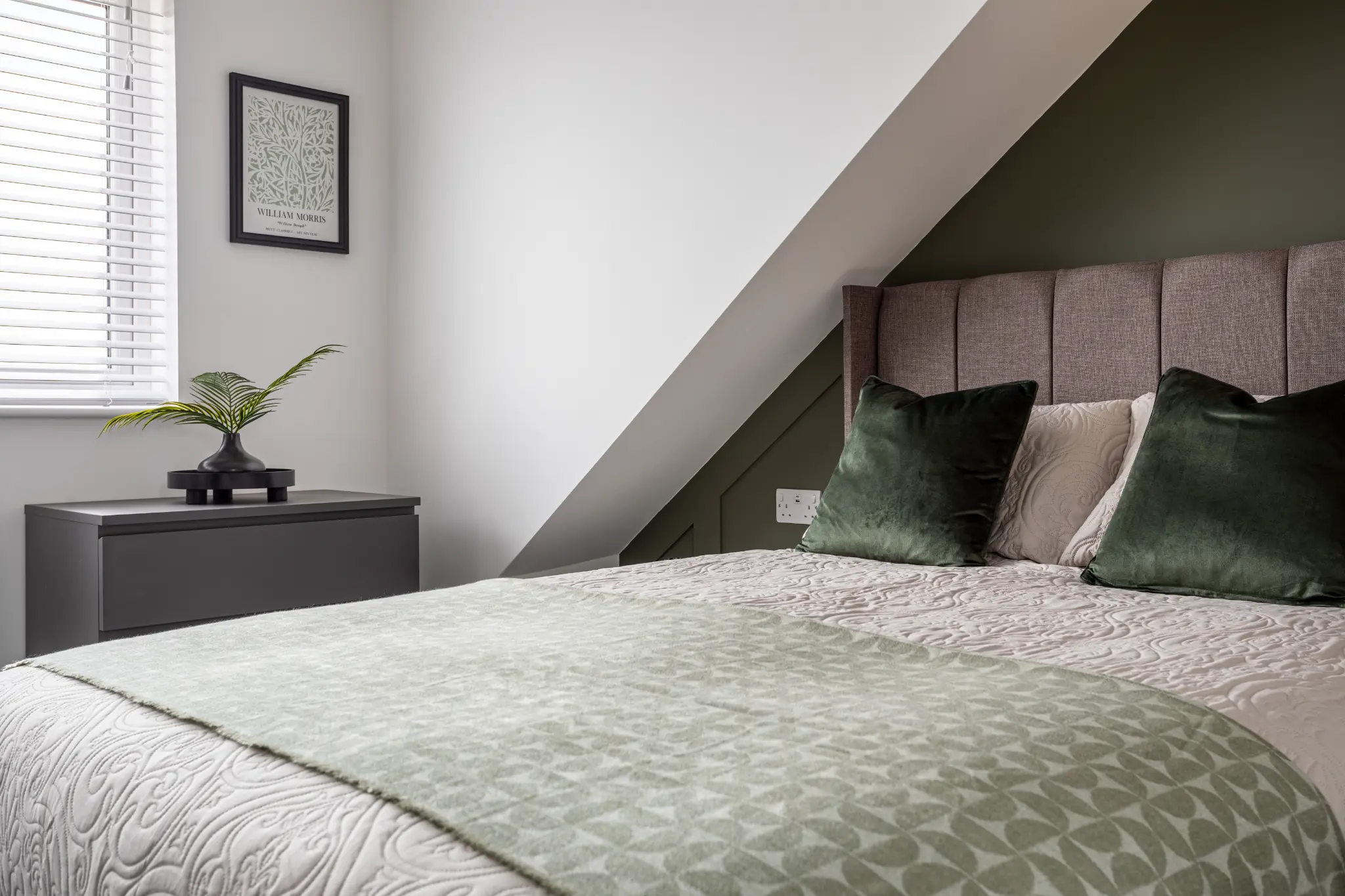
Closer on the bed and the panelled headboard wall. The panelling is one of the details that separates this building from a standard conversion, and it deserves a frame of its own rather than only appearing in the background of a wide shot.
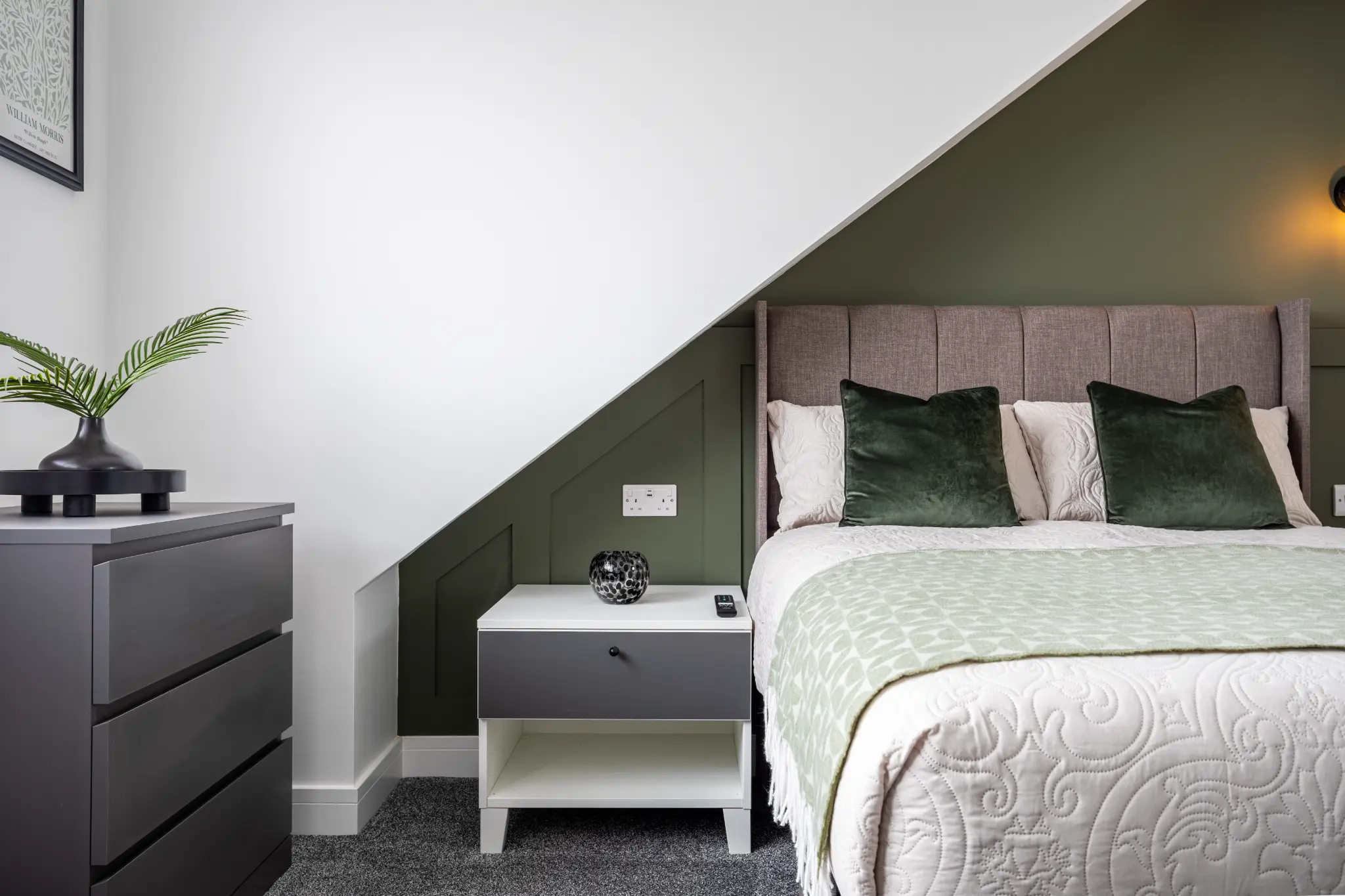
Bed, bedside table, and chest of drawers in one composition. Storage is a practical concern for anyone moving into a room rather than a whole house, because everything they own has to fit in it. Showing the storage clearly is not glamorous but it answers a real question.
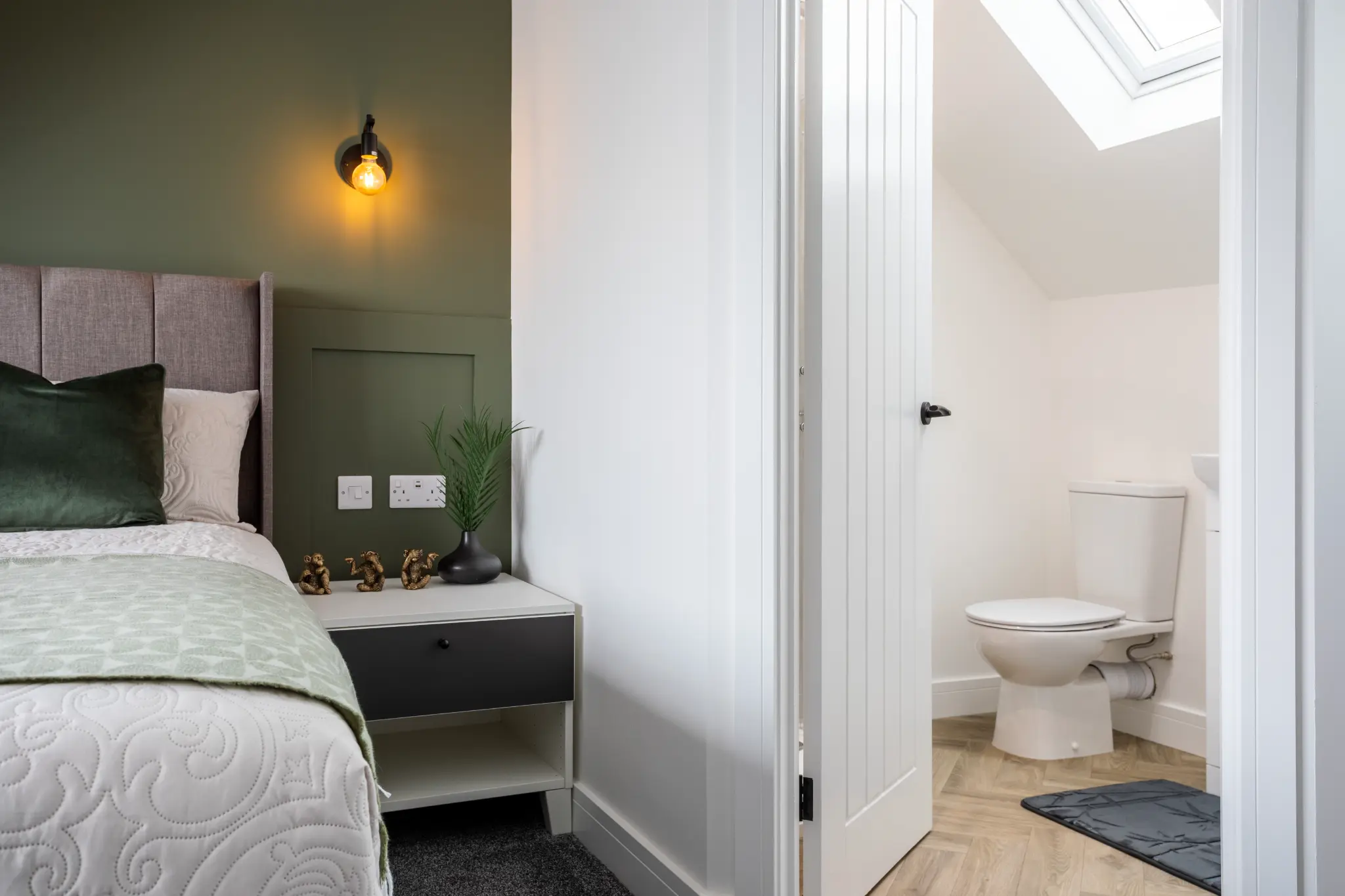
A tighter frame with the wall light switched on and the en-suite door open beyond. Turning the wall lights on for some frames and off for others gives the set variety and, more usefully, shows a tenant what the room looks like in the evening rather than only at midday.
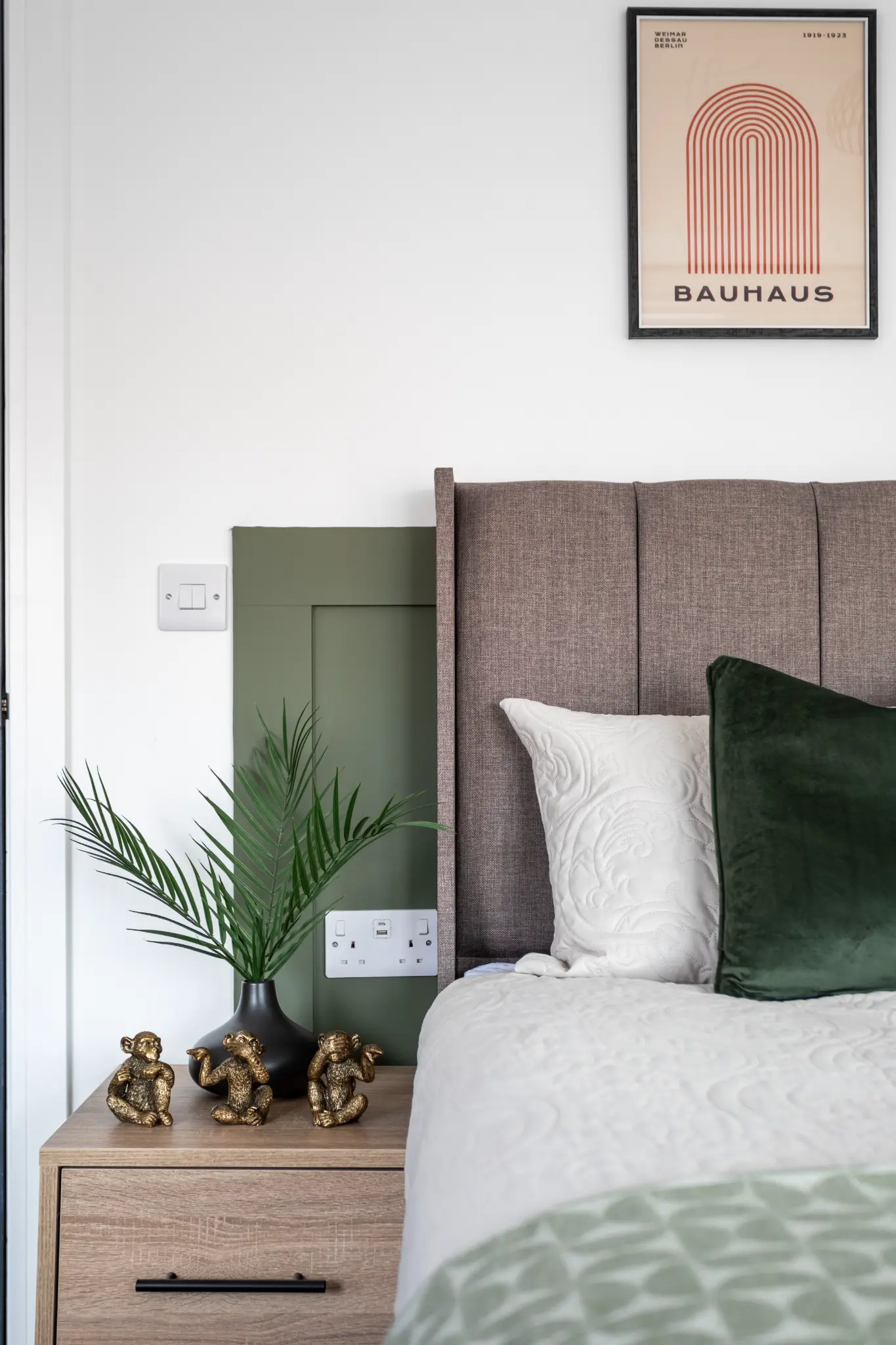
Detail frames like this bedside vignette, with the framed print, the plant, and the brass ornaments, are the images that do the most for the developer's portfolio and the least for the room advert. They communicate care and intent. They are the difference between a portfolio that says "I converted a building" and one that says "I know what I am doing".
04Desks and Working From Home
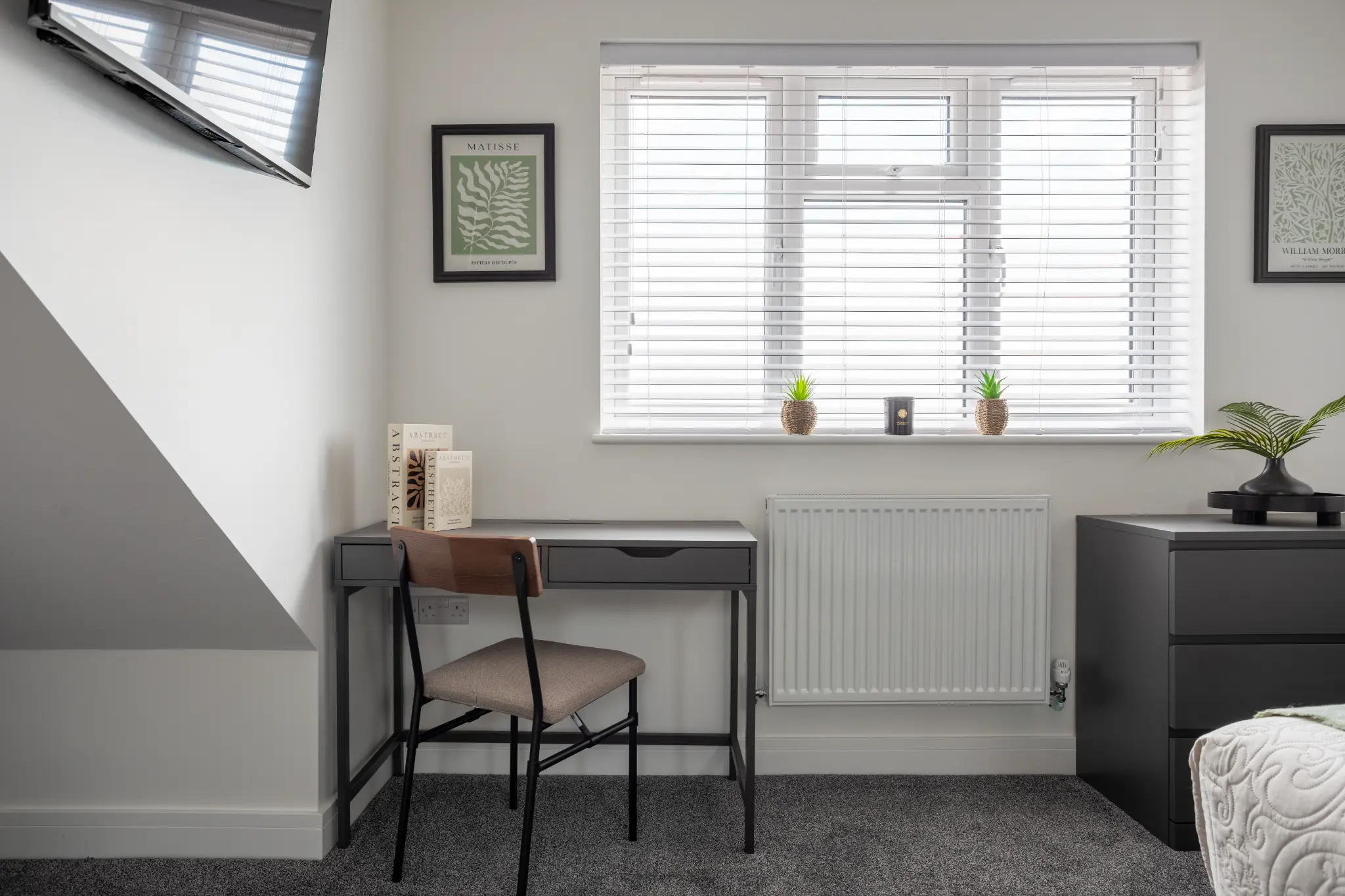
Every room in this building has a proper desk, and that is worth photographing specifically. A meaningful proportion of house share tenants now work from home at least part of the week, and a room with a usable workspace commands more and lets faster than one without. If the desk only appears as a corner of a wide shot, the advert is not making the point.
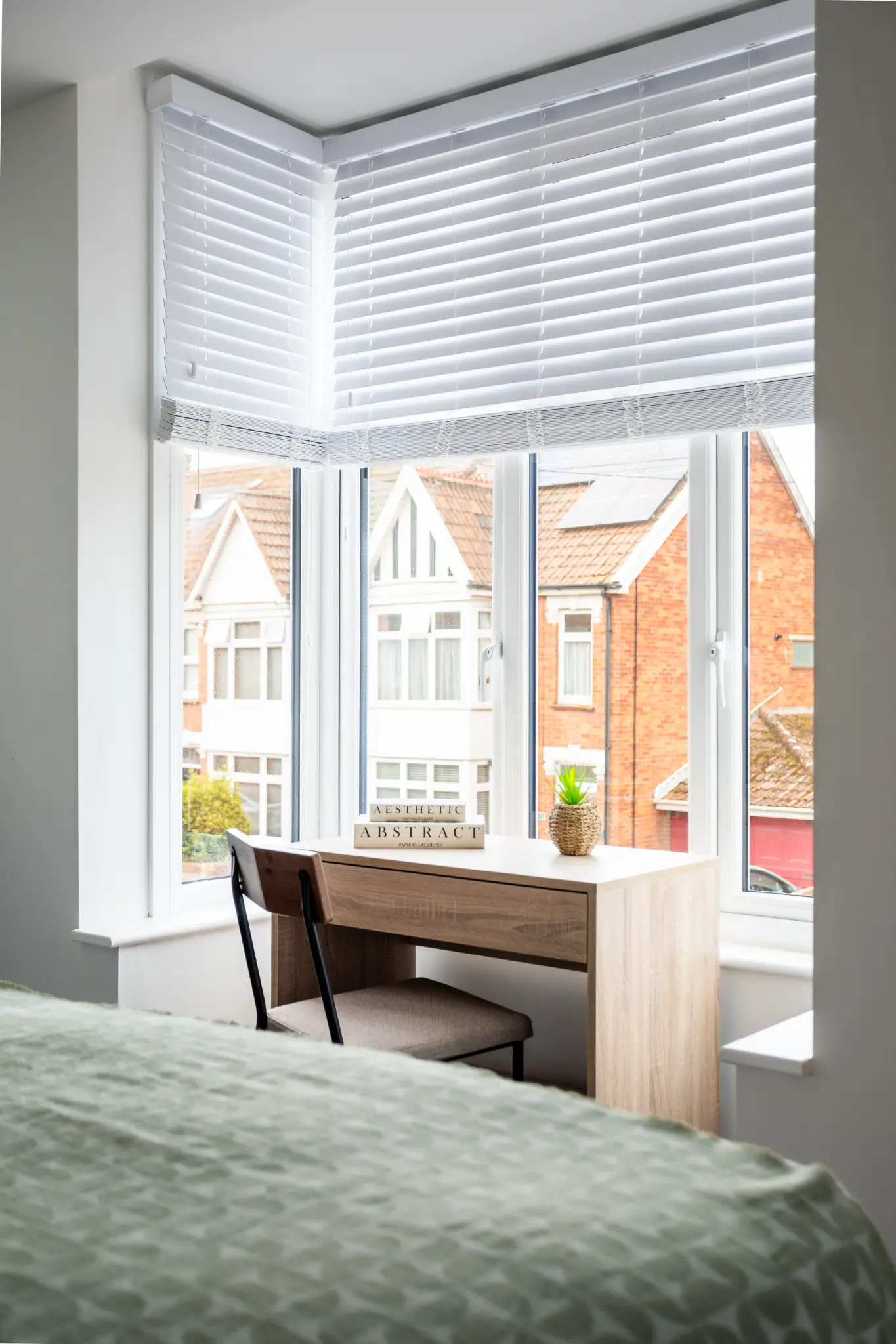
The bay window desk in this room looks out over the Bridgwater rooftops. Shot portrait, with the window light coming in from the left and the desk in the foreground, it is one of the most appealing frames in the set. It also does something subtle for the advert: it shows a view, and views reassure people that a room is above ground and gets light.
05The En-Suites
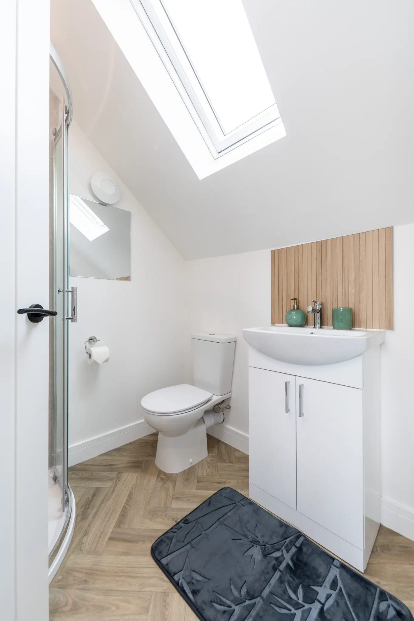
Private en-suites are the commercial argument for this building, so they needed proper coverage rather than one apologetic snap. Corner shower, WC, vanity basin, timber slat panel, and a velux above. Small wet rooms are among the hardest spaces in property photography, because there is nowhere to stand, every surface reflects, and the mirror will show the camera if you are not careful about where you position yourself.
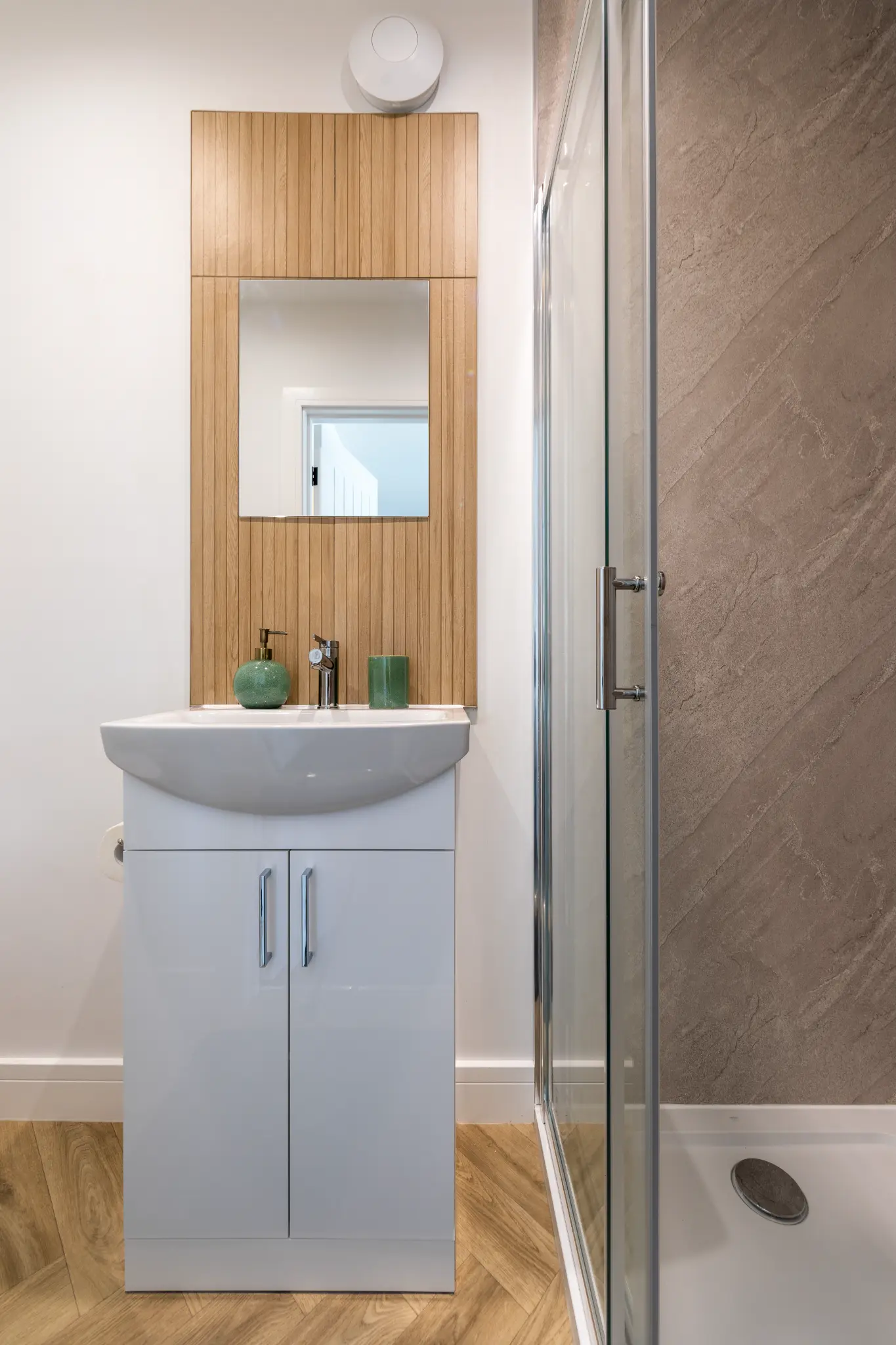
Tighter on the basin, mirror, and shower enclosure. Shot portrait, which suits the proportions of the space far better than forcing a landscape crop.
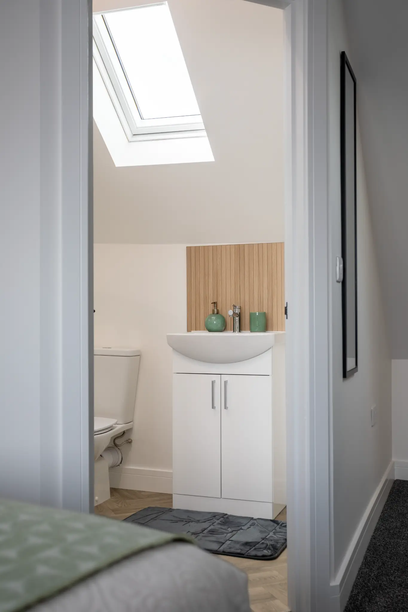
Shooting the en-suite from inside the bedroom, framed by the doorway, does something a straight bathroom photograph cannot. It shows the relationship between the two spaces, which is the entire selling point of an en-suite room. The viewer immediately understands that the shower is theirs and theirs alone.
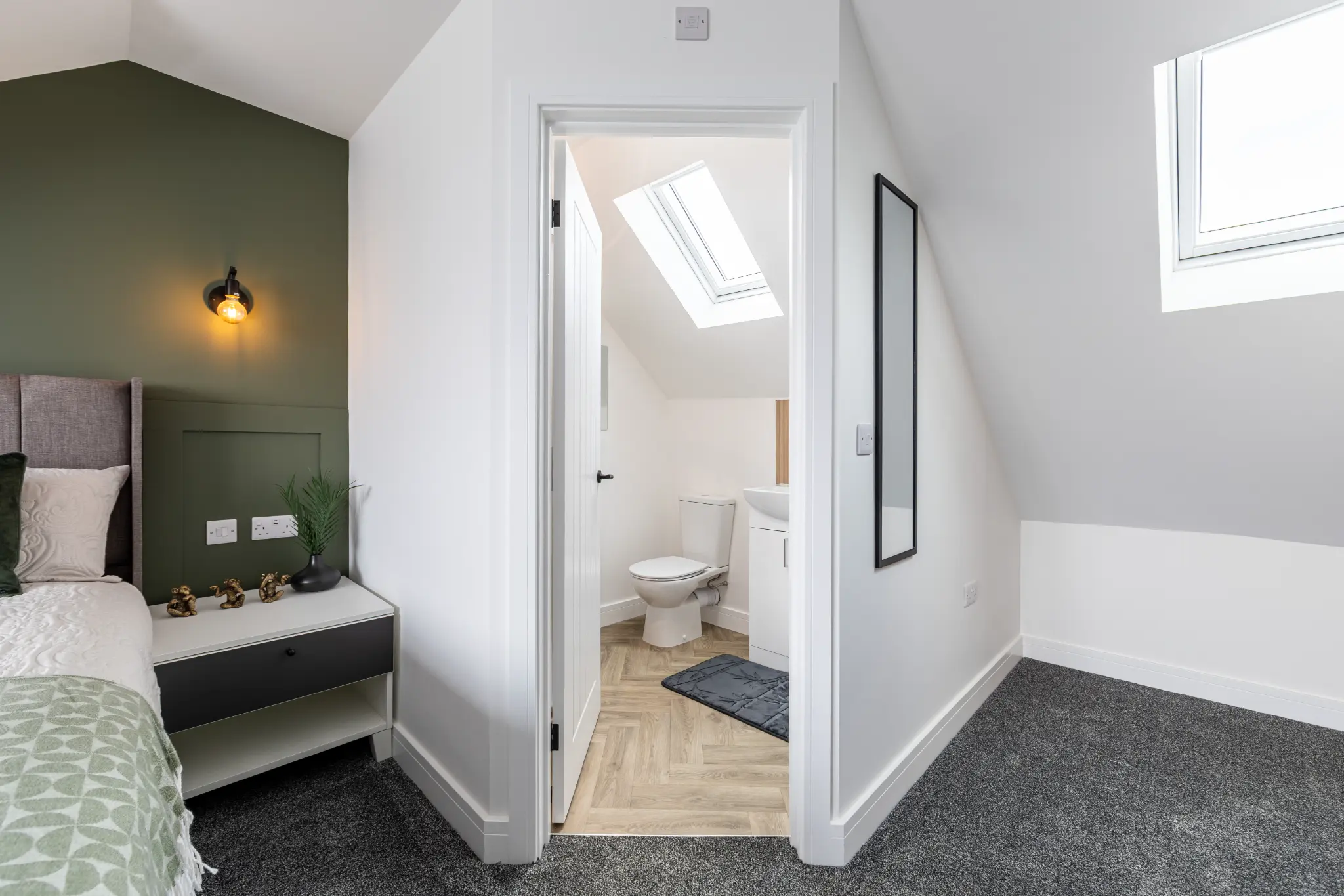
The same idea from further back in the loft room, with the herringbone flooring leading the eye through the open door. For a room advert this is arguably the most persuasive single frame available, because it makes the private facilities obvious without the reader having to parse the description.
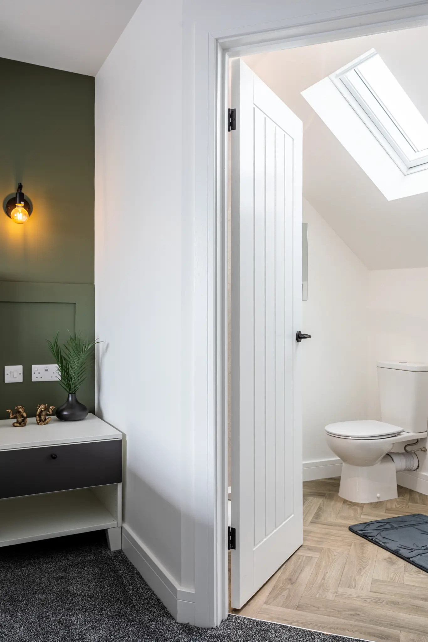
A further en-suite from a second room, shot to match. Again, consistency is deliberate. Every room's en-suite is photographed the same way, so no room looks worse than another simply because of how it was shot.
06The Studio Rooms
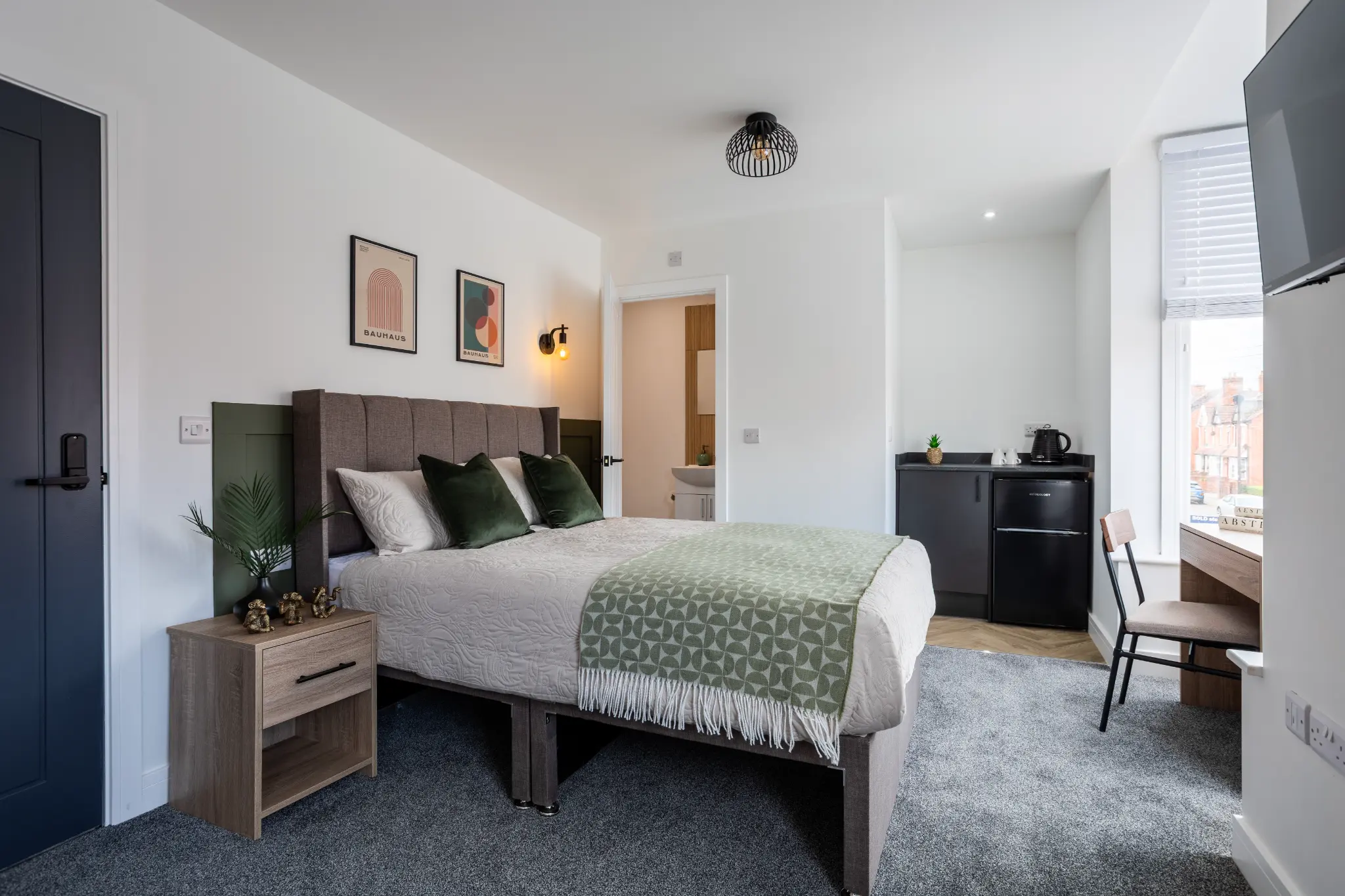
Two of the units are effectively self-contained studios, with a kitchenette in the room alongside the private en-suite. These let to a different tenant entirely, someone who wants independence rather than a house share, and they need their own images that make the self-contained nature obvious.
I composed this to include the bed, the kitchenette with its mini fridge, and the en-suite door in a single frame, so the completeness of the unit reads immediately.
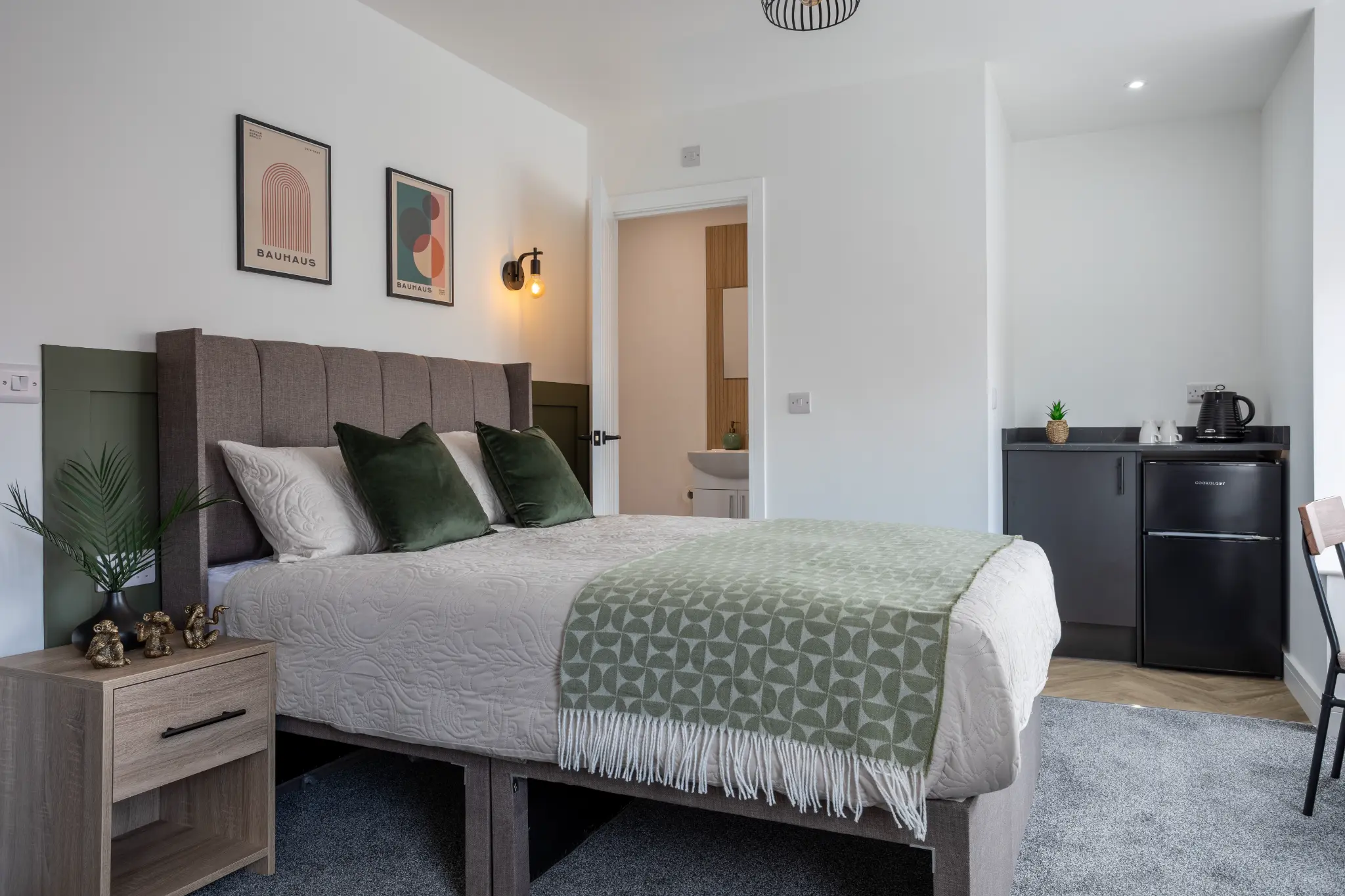
Closer on the kitchenette end, showing the TV, the kettle, and the doorway through to the en-suite. Between the two frames, a prospective tenant can understand exactly what they are renting without a viewing, which matters when a lot of enquiries for rooms like this come from people relocating from elsewhere.
07How the Set Was Structured
The whole shoot was planned around the two uses from the outset, and that shaped a few decisions worth spelling out.
Every letting room received the same three-frame minimum: one wide establishing shot from the doorway, one closer frame of the bed and storage, and one of the en-suite. Anything beyond that was a bonus. That baseline is what makes the library usable for room marketing later, because there is no room in the building without a complete, consistent set.
Shared spaces received more coverage than a single-let property would justify, from multiple angles and in both orientations. Shared spaces appear in every room advert for the building, so those images get used far more often than any individual room shot and are worth the extra time.
Portrait frames were shot deliberately throughout rather than left to chance. Room adverts on phones, social posts, and spare-room listing formats all favour portrait, and a library without any portrait images forces awkward crops later.
Lighting was varied intentionally, some frames with the wall and pendant lights on, others relying on daylight alone. It gives the portfolio range and gives the letting agent options depending on when in the year a room is being advertised.
08Why This Matters for HMO Landlords and Developers
There is a straightforward commercial case here. Void periods are the single largest avoidable cost in an HMO. A room sitting empty for three weeks at £600 a month costs more than the marginal cost of photographing the building properly, and that photography then serves every future void for years.
There is also a funding argument. Developers scaling an HMO portfolio need to demonstrate to lenders, joint venture partners, and investors that the quality of their conversions is real. A well-photographed completed project is the most direct evidence available, considerably more persuasive than a spreadsheet of yields with no imagery behind it.
For anyone weighing this up, the practical point is that the cost per room falls sharply the more rooms are in the building, because the shared spaces are photographed once regardless. A six-room HMO is not six times the work of a one-room shoot.
If you are converting or refurbishing HMOs in Somerset or the wider South West, I would encourage photographing the building the week the styling goes in, before the first tenant moves a single box. That window, when every room is complete and nothing is occupied, does not come round again once the building is let.
09Ready to Photograph Your HMO?
If you run or develop HMOs, co-living schemes, or serviced house shares, get in touch for a free quote. I photograph HMOs across Somerset and Bristol, including Bridgwater, Taunton, Weston-super-Mare, and Bath, with full coverage available UK-wide for portfolio landlords with buildings in multiple towns. You can also read more about HMO and co-living photography and what a shoot covers. For broader developer, workplace or commercial-space briefs, explore commercial photography across Somerset.
Related: HMO & co-living photography | Student accommodation photography | Property photography in Bridgwater