I've shot for care homes long enough to spot a pattern: the people making the actual decision about where a parent or relative is going to live are almost never the people who run the home's marketing. They're often hundreds of miles away. They're often researching at 10pm after work. And they're almost always doing it on a phone. That changes everything about what your website needs to do.
In this piece I want to walk through, in order, what a family member actually looks at when they land on a care home's website — and the gaps I see across the sector that are quietly costing homes the enquiry.
01Stage 1: They've already done their homework before they reach you
By the time someone arrives on your website, they have usually already checked your CQC rating and read the latest inspection report, looked at your reviews on carehome.co.uk, got a rough idea of cost from the local authority guidance, and read at least one independent guide to choosing a care home.
So your website isn't being judged in isolation. It's being judged against a quiet checklist of "yes, this matches what I expected" or "hmm, this doesn't feel like the home I read about". Your photography is the fastest signal in that comparison, and the easiest one to get wrong.
02Stage 2: The communal areas — does this feel like somewhere I'd want to spend an afternoon?
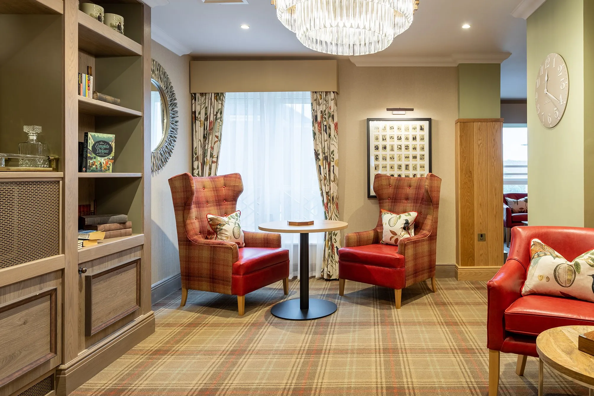
The first thing families look for is the shared spaces: the main lounge, the dining room, the activity area. Not because they care about the soft furnishings, but because those rooms tell them whether the home feels warm and lived-in or sterile and clinical.
What I look for when I'm shooting these is usually different from what an interiors photographer would prioritise. I want natural light wherever possible, even if it means waiting for the right time of day. Furniture arranged for conversation, not for the cameras (residents actually use those chairs). Subtle signs of life — a tea tray, a partly-finished puzzle, an open book on a side table. These read as "real" in a way that perfectly staged rooms don't.
The single biggest mistake I see on care home websites is using a wide architectural shot of the lounge with nobody in it and all the chairs pushed back against the wall. It looks like a furniture showroom. Families don't bond with furniture showrooms.
03Stage 3: A bedroom that looks like a home, not a clinic
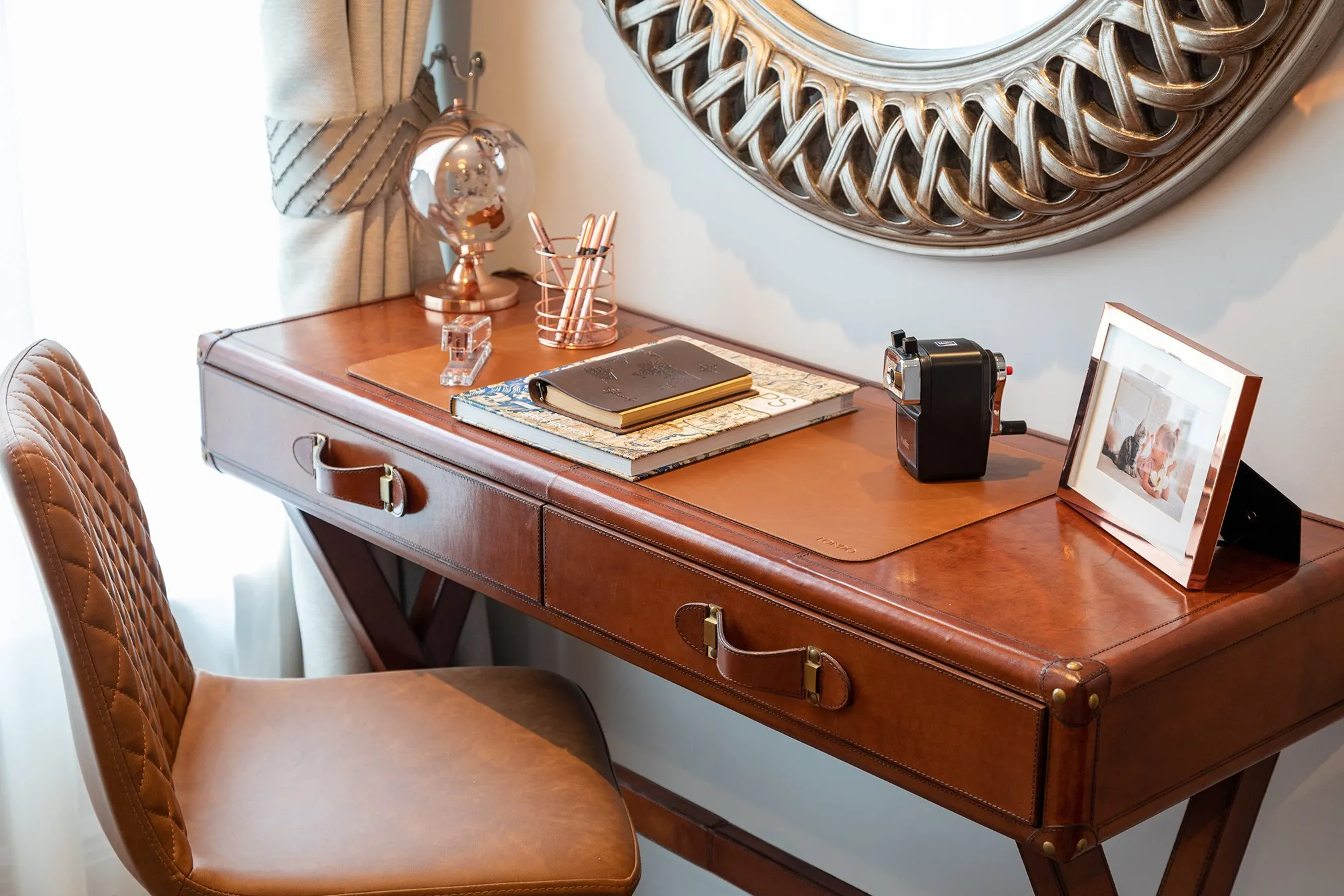
The bedroom shot is the most emotionally charged image on your entire website. It's the room a family is mentally placing their relative in. They're looking for enough space, a proper window, room for personal belongings, and a quality of finish that says "this isn't institutional".
A few things that quietly work against most care home bedroom photos:
- Hospital-style adjustable beds photographed flat from across the room — they scream clinical. Better to shoot at an angle, with the bedding dressed properly and a chair or side table in frame.
- No personal effects — a bare room reads as a holiday inn. A few suggestions like a watercolour print, a small framed photo, a cushion make the room feel like somewhere a person already lives.
- The window facing into the lens — hot blown-out backgrounds make the rest of the room look gloomy. Either shoot away from the window or take a few brackets and properly balance the exposures in post.
For groups with multiple room types — studios, suites, ground-floor with garden access — show one or two of each. Families want to know there's a real choice, not a single template.
04Stage 4: The gardens and outdoor space
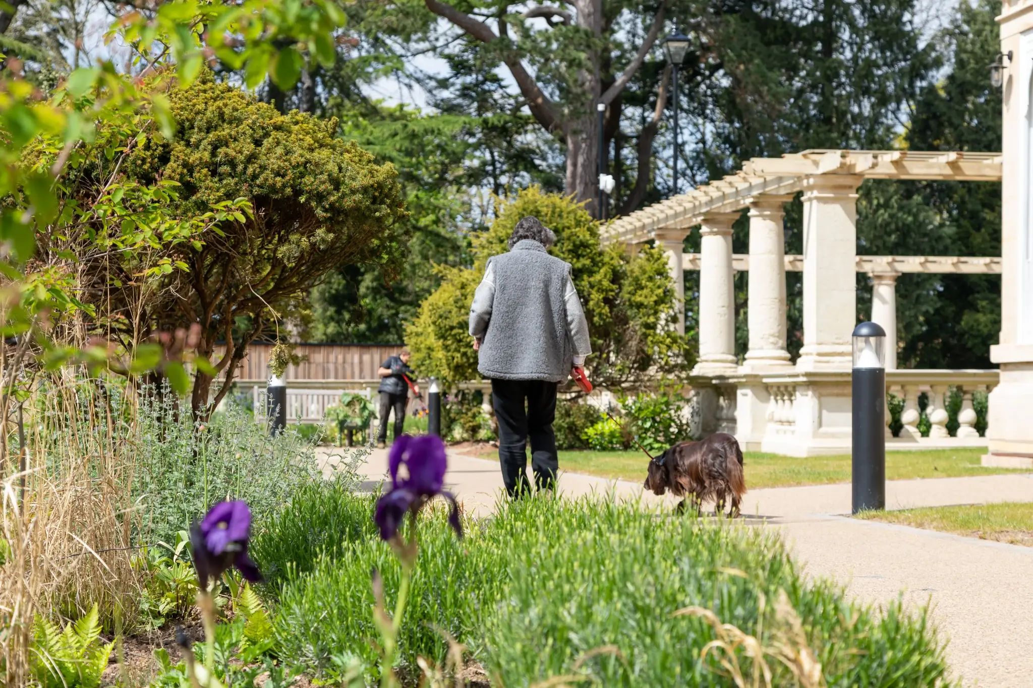
Almost without exception, the gardens are the most underused asset on a care home website. Outdoor space matters disproportionately to families: it signals freedom, autonomy, fresh air, somewhere to sit with a visitor. And yet most homes use one tired aerial shot of the patio and call it done.
If you have any of the following, get them photographed properly: a sensory garden, raised beds, a quiet corner with seating, a path you can actually walk to the end of, a proper view, outdoor furniture in use.
Drone gives you context (this place has real grounds), ground-level lifestyle shots give you warmth (someone could sit here).
05Stage 5: The thing most websites don't have — a virtual tour
Here's the gap I see most often, and it's the one that costs the most enquiries.
A Matterport 3D walkaround lets a family in Newcastle "walk" the corridors of a home in Devon at 11pm on a Sunday. They can scroll into the dining room, look at the size of a typical bedroom, see how far the lounge is from the garden door, get a sense of the building's scale. They can do all of this without booking a viewing, taking a day off work, or driving 200 miles.
The argument I sometimes hear against tours is "we'd rather they came and saw the home in person". I understand the instinct, but it misses the point: the families who will visit your home are the ones who've already mentally shortlisted it from their phone. A tour doesn't replace the in-person visit. It earns it.
Tours also do useful things on the recruitment side that don't get talked about enough. Carers and nurses considering a job will absolutely look at the building before applying. A virtual tour shows them the same things it shows families — and tells them you've invested in the home's presentation.
06Stage 6: Photos of people, but only if they're real
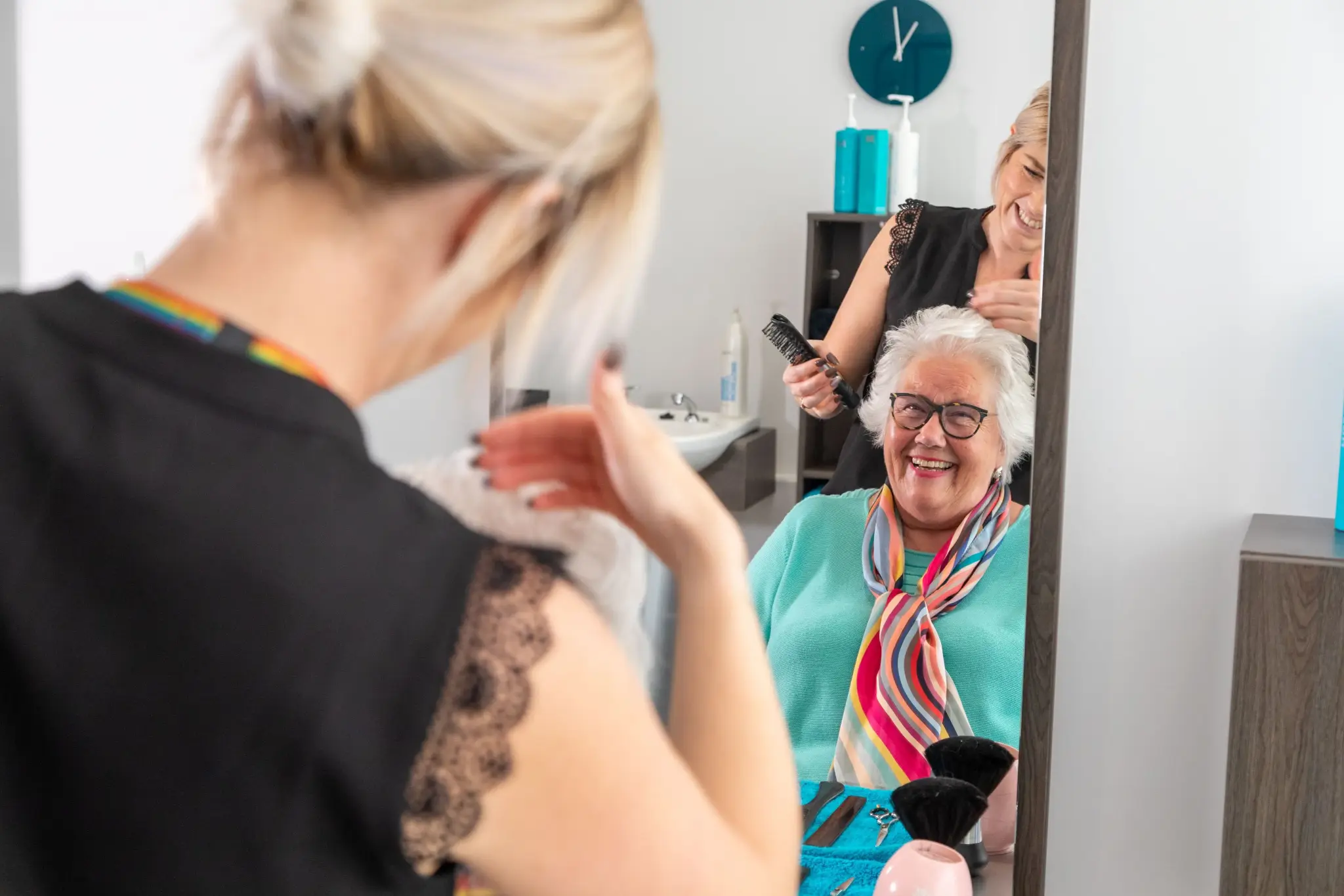
A small note on this: lifestyle photography in care homes is brilliant when it's real and a disaster when it isn't. Stock images of grinning models in scrubs reading age-appropriate magazines to age-appropriate residents are the visual equivalent of a press release. Families spot it instantly and trust you a little less for it.
The fix is straightforward but takes care: get proper consent (residents and families), shoot moments rather than poses (a hand on a forearm, someone mid-conversation, staff in motion not staring at the camera), and credit the home rather than the photographer. Done well, these are some of the most powerful images a care home can have.
07What "getting this right" actually does for a home
I don't have data on every shoot I've done, but the homes that have invested in this work usually see:
- More time-on-site from family visitors
- More direct enquiries rather than calls that need re-qualifying
- Better conversion from enquiry to viewing
- Useful recruitment side-effects (applicants who arrive having already toured the building)
None of which require you to spend more on lead generation. They're earned by being clearer, warmer, and more transparent in the assets you already have.
08If this resonates
If you're looking at your own home's website and ticking off any of the above — old photography, no virtual tour (see my care home virtual tour options), a bedroom shot that doesn't look like home — I'd be happy to chat about what a refresh would look like for your home. I work nationwide, turn round in 48 hours, and publish my pricing so there are no surprises.
Read more about care home photography and 3D tours →
Or call me on 07545 450543 — no pitch, just useful.
— Matthew
--- I photograph care homes and assisted living facilities across the South West. Get in touch or call 07545 450543 to discuss your project.